"The branding looks so much more professional now, and I believe we are getting a lot more work from it. Thanks again." - John Kirton (JJBUILD)
Toast have just recently finished another successful rebranding project, this time for the Australian owned property development company JJBuild. JJBuild approached Toast to rework their existing brand and give it a more professional and modern touch. As with all clients our first step was to research and find out exactly how to update and represent the brand in a new and effective way.
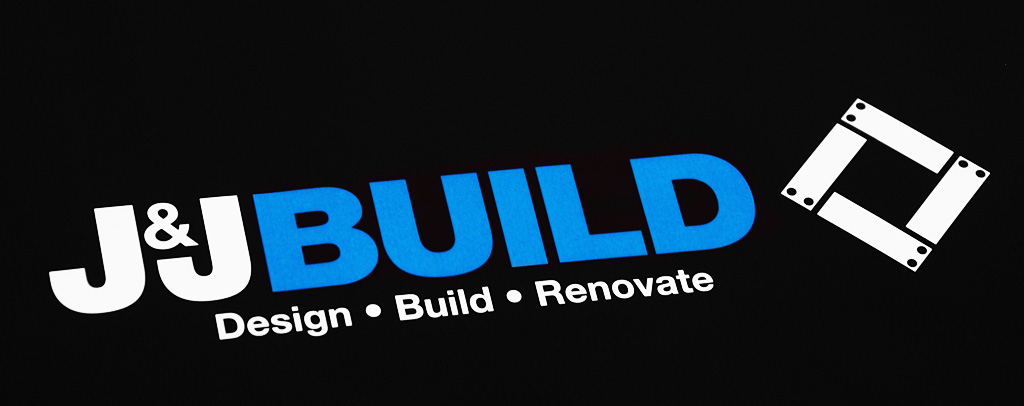
We started by working on several logo concepts (shown above) to find the direction that JJBuild wished to head in. The chosen concept (our first presented) is a fusion of concepts and ideas, at first glance the four boxes represent four planks of wood, but looking closer there is much more to it. The square/diamond is a symbol of order, stability and perfection, its shape along with right-angles, are a fundamental element of design and construction. Furthermore, if your look closely you will also see two Js interlocking.
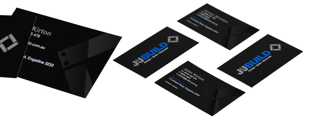
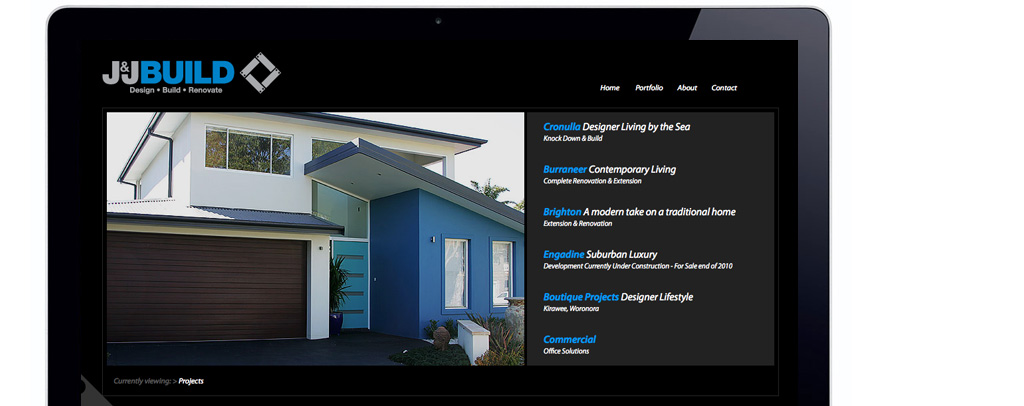
One the logo and colour scheme was chosen we set off to create the remainder of the brand identity, which included business cards, letterhead, with compliments slips and the website. The web design initially was to be created in Flash using Actionscript 3, but during the wireframing and architecture stages it was clear that for maximum functionality it would be wiser to use a combination of standard Flash animations and complex Ajax/Javascript programming. The end result was a simple solid and functional portfolio website.
Do you have a Branding (or re-branding) project?


