Ensyne specialise in the development of iPad applications – from concept through to delivery.
As part of the next phase of growth for the business, Ensyne enlisted the skills of Toast to craft a brand that is neutral, adaptable, subtle and timeless.
With a long term outlook and strategy in, it was vital for us to develop an identity that would stand the test of time. And having a diverse range of applications, something able to work in a variety of circumstances was of high priority.
Without the use of additional symbols or graphic elements which could date but also distract, we set our sights on addressing three key concepts in the identity in a subtle manner:
1) Textual content – at the core of each Ensyne application is text.
2) Digital – every app produced will be delivered in a digital format.
3) eBook/App – we wanted to reference something specific about electronic books/apps.
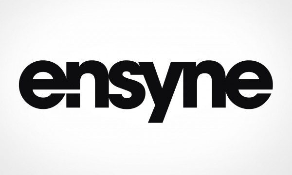
All three ideas were successfully and ever-so-subtly integrated into the final logotype.
Adding a swipe between the ‘e’ and ‘n’ addressed point 3, mimicking the swiping motion all touchscreen devices rely upon. Further, the break in the first ‘n’ creates a full stop (period), a reference to the most fundamental element in all text – grammar. Finally, by using a square full stop we suggest a single pixel – essential for displaying content on an electronic screen.
With branding complete, a website and stationery followed – carrying on the subtlety of the identity.

Clean, simple website design.

Website Design

Motion in logotype
Logotype - in-app.