Family owned & operated Olivanica have been producing small runs of exceptionally fine quality olive oil for a few years with great success. In late 2010, we were approached to create an identity and packaging design to reflect the outstanding quality and purity of the oil.
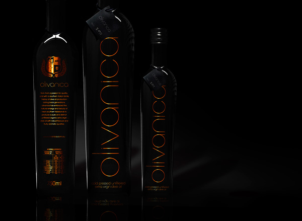
Without a long history, and being an Australian company, a typical/traditional design would have been fraudulent. Instead, we opted to accentuate the traits of the product – its purity, quality and elegance while simultaneously developing a packaging design to stand out amongst its competitors.
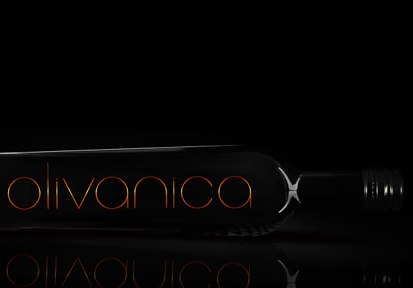
We created custom typography for the logotype, reflecting the purity of the oil by using letterforms based on perfect circles and straight lines without any unnecessary elements.
Elegant, sophisticated and simple, maximum impact is attained in the packaging design with minimal clutter and use of just a single ink “colour” – a copper foil.
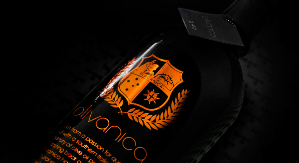
For the reverse, a family crest was developed to tell the story of the family behind Olivanica – whose Italian heritage has engrained with them an appreciation for great food and premium ingredients.
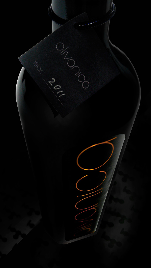
Before delivery, each bottle is adorned with unique a hand-written tag denoting its year of production – a reminder of its exclusivity and quality.
Update: Since our repackaging of Olivanica, the oil has taken out a handful of medals, including Silver & Bronze at the Sydney Royal Fine Food Show 2011.


