We were assigned the task of creating a promotional book to reflect two key aspects of Resbuild Australia – their innovative designs and their exponential growth as a business.
Taking the basic shapes associated with design and construction (circles and squares), along with elements from the existing Resbuild identity, we abstracted these building blocks in such a way as to illustrate the stylish, intricate architectural designs Resbuild pride themselves on, to show the diversity in their work and also to reflect the growth of the company. Ascending shapes, outward-growing concentric circles, progress from left-to-right, detailed patterns and a rigid grid system fused together for the final product.
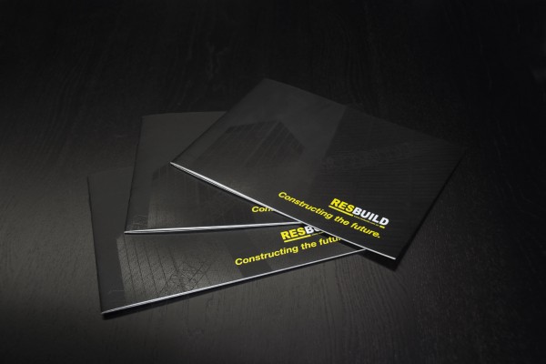
To accentuate the Resbuild brand we opted for a 2 colour Pantone job featuring Black and Yellow inks only. Vivid results were achieved with this striking colour palette.
Since completing this project, our delighted client has informed us that the response to the books has been unanimously positive. An eye-catching cover has become a conversational piece during meetings, the internal spreads have had equally strong responses. Resbuild have seen a sharp increase in work which they happily attribute to the books’ impact.

Double Page Spread with Pantone Overprints

Double Page Spread

Health and Safety double page spread

Close View of Halftone pattern and Pantone overprints.

Front Cover featuring a Spot Varnish Halftone Pattern

Pantone Overprint up close