A new business, Wambowl approached us in 2011 to get them off on the right foot with branding, stationery and a website to accelerate growth from day one.
Creators of extremely high quality sculpture, statues, fountains, art, lanterns and more – each hand carved from a single piece of stone (almost all made from marble), Wambowl asked us to create something distinct, simple, and representative of their stonecraft.
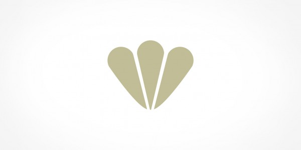
Our solution was a custom typeface coupled with a bold icon, featuring both gentle curves, rounded edges and some absolutely straight lines to reflect the diversity and finesse involved in the hand-carving of each of their one-off pieces. The three segments of the “W” shaped icon represent the elements found in marble: Calcium, Carbon & Oxygen.
The Wambowl brand colours are based on tones often found in stone and sediments. These tones flowed across printer collateral and into the website design, whose primary aim is to make people aware of the range of products available, to reflect the quality of each unique piece, and to generate business enquiries.
Since launching the Wambowl brand and website, Wambowl have experience a swift growth period, having to take on additional staff to handle interest. We wish them further success and continued growth into the future.
Wambowl Identity - Web

Business Card Design

DL Flyer - Back

Website Design

Website Design