With high quality muffins, cakes & biscuits available throughout NSW supermarkets including IGA, Sunfield approached us for a complete rebranding and repackaging to propel the business into a new phase of growth.
We’ve just completed the rebranding stage of this project (with new packaging designs soon to come).
Our brief was to freshen up Sunfield, to create a much stronger, more recognisable identity, and to develop something that would be able to be applied to a range of packaging styles, shapes and sizes (including boxes, wraps and containers).
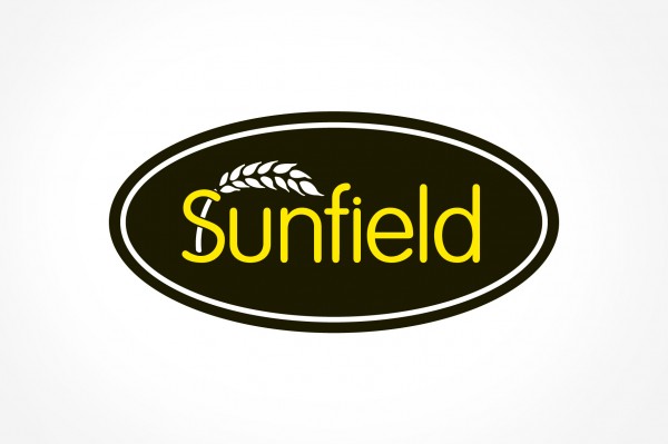
We achieved this by using a strong black oval to encapsulate the brand name, complimented by a vivid yellow – an instantly recognisable combination.
“Sunfield” appears in thin, rounded type – countering the harshness of the black and a wheat illustration grows out from behind the ‘S’, breathing additional life while also making a connection to the fundamental ingredient in all Sunfield products – wheat flour.

Sunfield Bakery Branding - Stationery

Wheat Pattern

Branding - Stationery - Letterhead

Branding - Stationery - With Comps Slip